The Devil
In late November of 2021, The New Jersey Devils released their first ever third jersey in the franchise’s history. Although I like the design the team developed, I started playing around with ideas that I thought would look cool on a pro-sports team that featured the name the Devils.
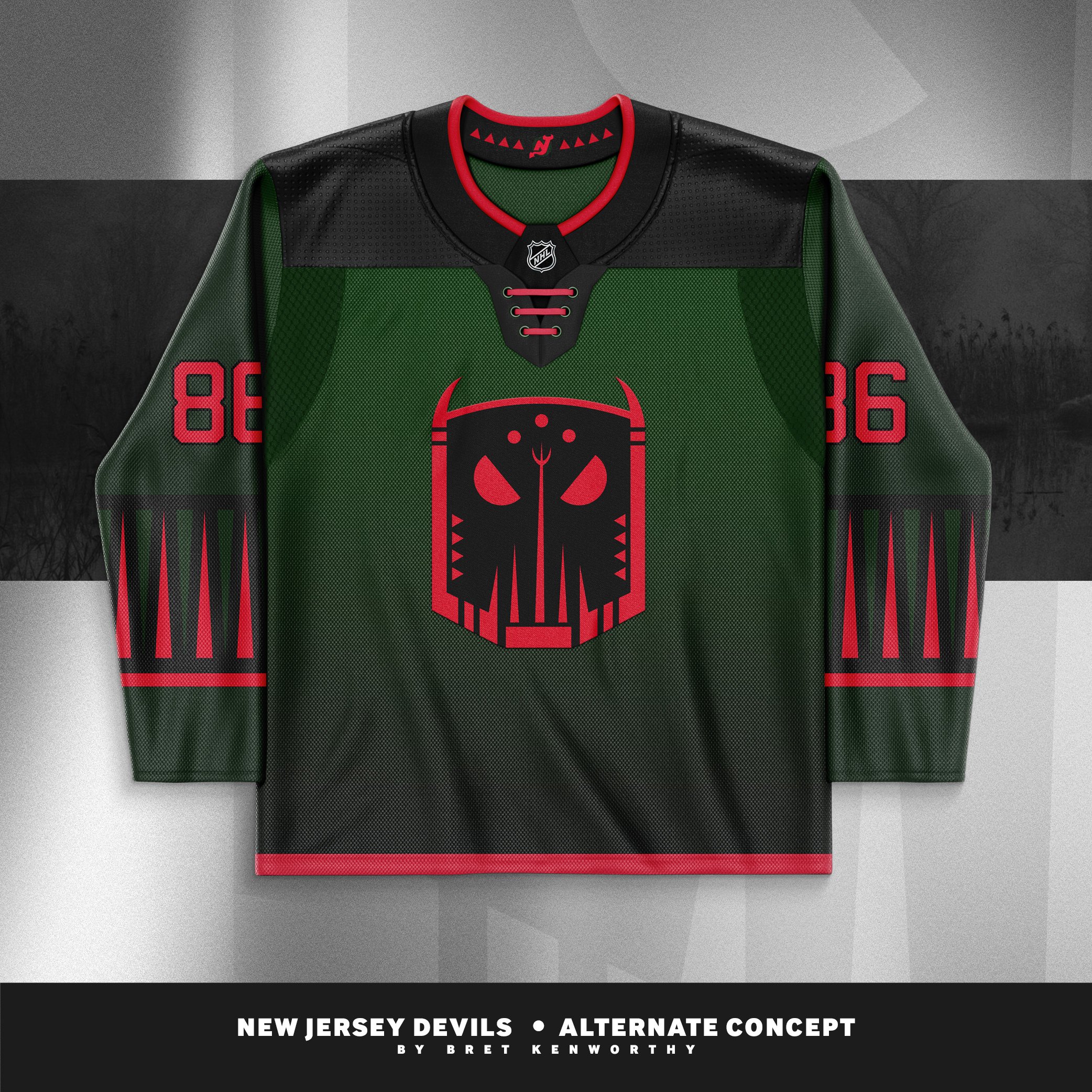
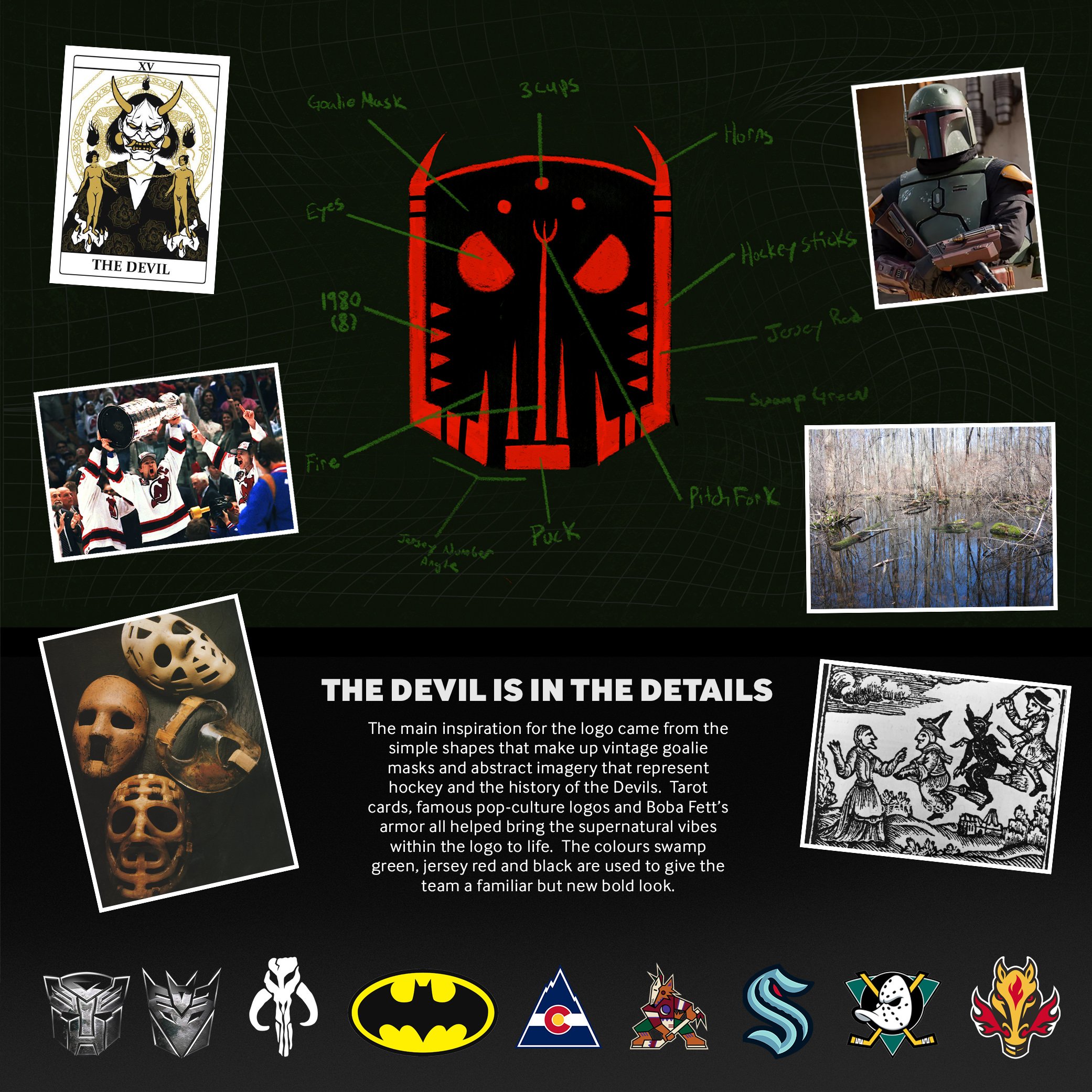
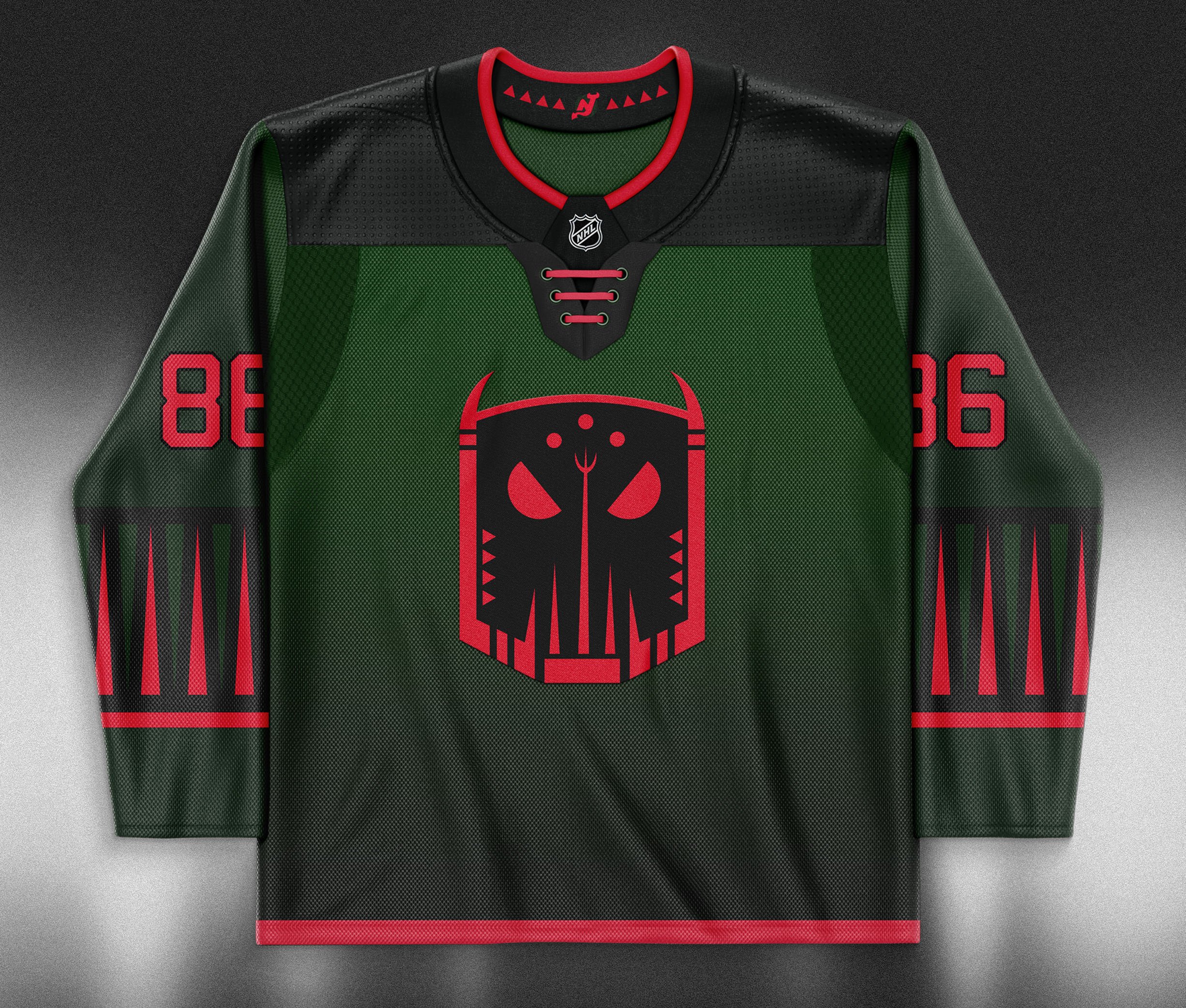
I started out by sketching simplified devil & goat heads and soon started to see the resemblance of a vintage goalie mask. Next, shapes of hockey sticks, a puck and a pitchfork were built into the design to help give the logo depth.
Once the base of the concept was figured out, I brought it to my iPad and started working on the fine detail and colours. Originally the eyes were just circles but once finalized I cut two slants into them to add some attitude.
The main inspiration for the logo came from the simple shapes that make up vintage goalie masks and abstract imagery that represent hockey and the history of the Devils. Tarot cards, famous pop-culture logos and Boba Fett’s armor all helped bring the supernatural vibes within the logo to life. The colours swamp green, jersey red and black are used to give the team a familiar but new bold look.
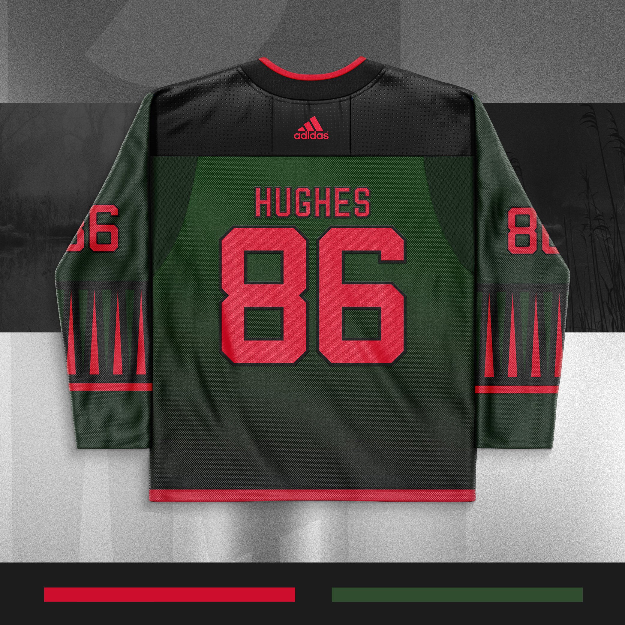
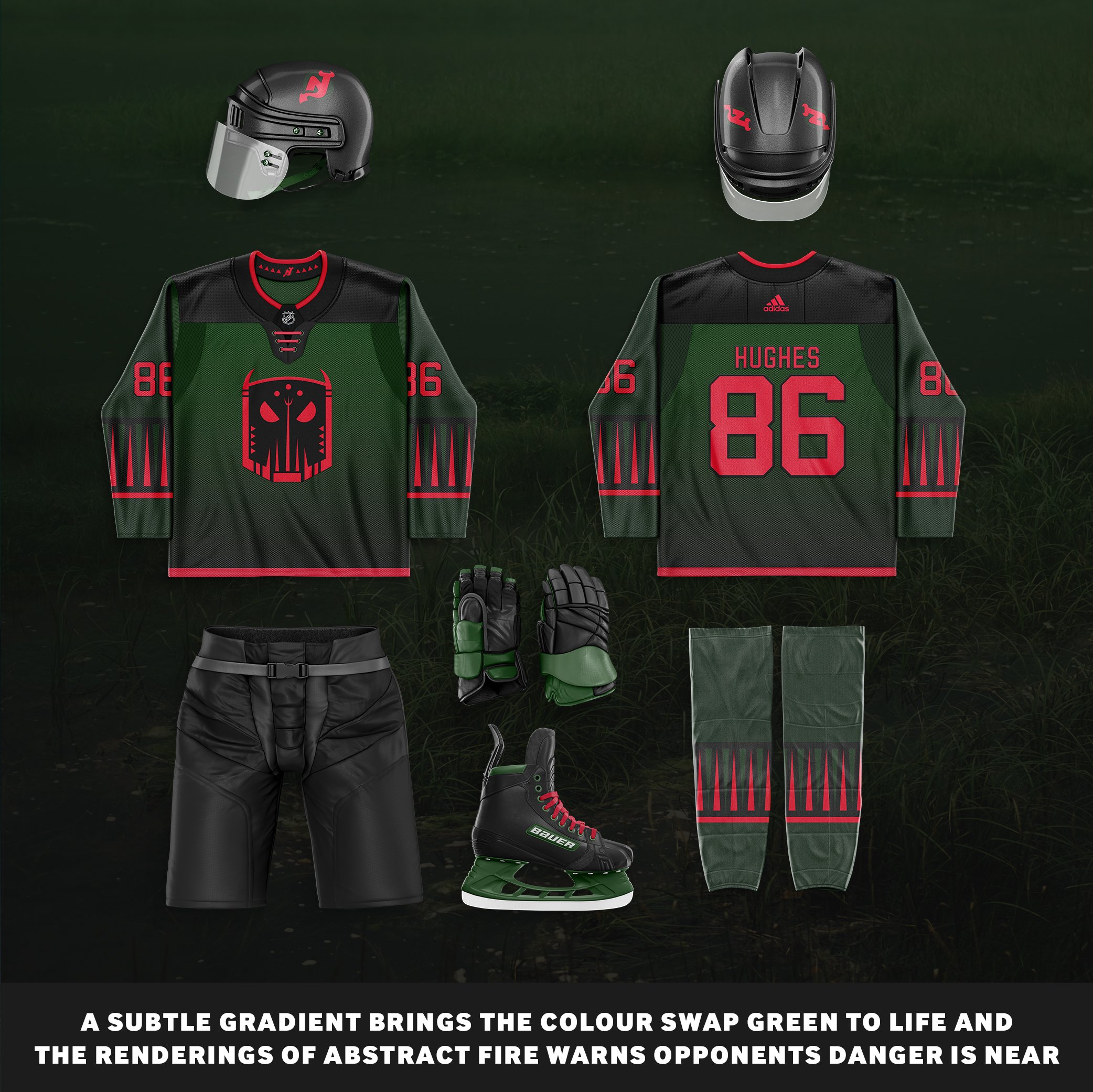
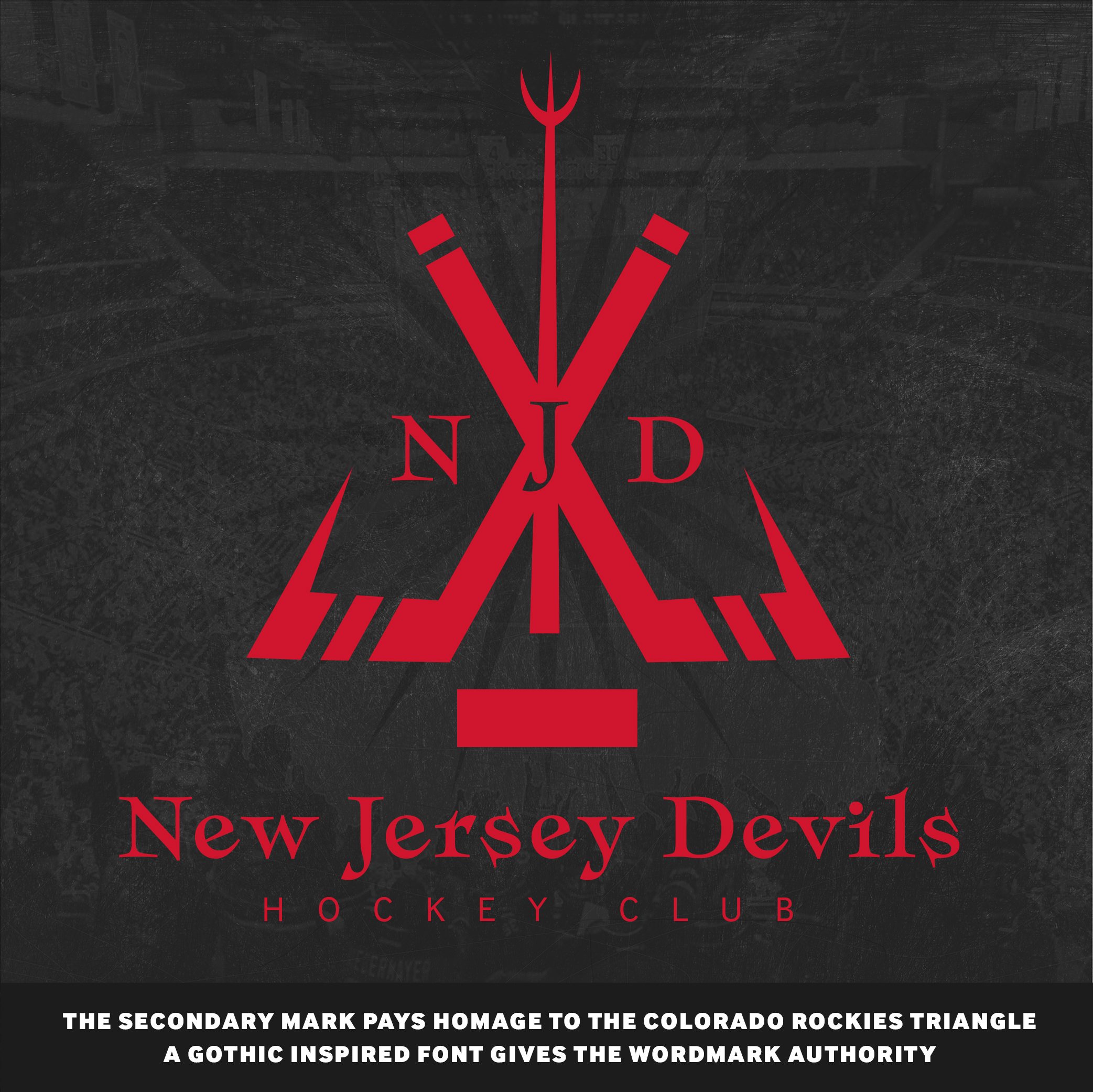
A subtle gradient brings the colour swap green to life and the renderings of abstract fire warns opponents danger is near. The secondary mark plays homage to the original Colorado Rockies’ logo that was in a shape of a triangle. Team branding features a gothic inspired font that gives the word-mark authority.
Programs: Illustrator + Photoshop